这里是 Frontend Focus 的中文翻译项目,每周在 己思 平台首发。
翻译及校对:richshaw2015,Yully Che
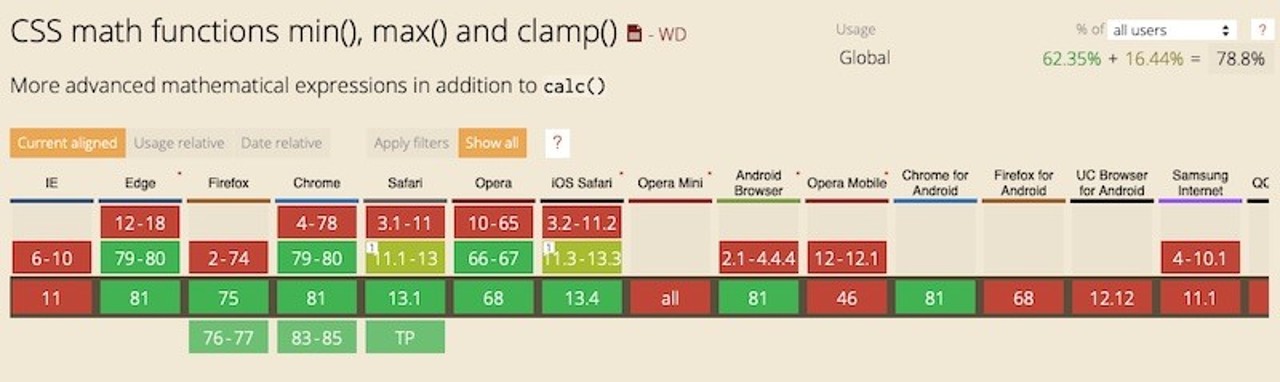
min(), max(), and clamp()` 等 CSS 魔术方法The min, max, and clamp functions are now starting to see more widespread browser support. Here’s a video running through how these properties can be used to really open up responsive typography techniques.
来源:Kevin Powell
Bootstrap core team member Andrés Galante runs through how we can ensure our font sizes are accessible by asking what sort of best practices we can rely on to make an accessible reading experience.

来源:CSS-Tricks
An excellent guide to the various features in CSS that can be used as part of an internationalisation strategy that goes beyond mere translation.
来源:Chen Hui Jing
AMP aims to be all about providing speed to mobile consumers of content but paywalls just, well, get in the way. So Google and the AMP folks have come up with a way where protected content can be served and unlocked client-side for more performance. Cynically, of course, you could consider this yet another form of DRM for Web content…
来源:The AMP Blog
A look at the current state of Flutter for browser-based apps and how to create a responsive app using it.

来源:Carmine Zaccagnino
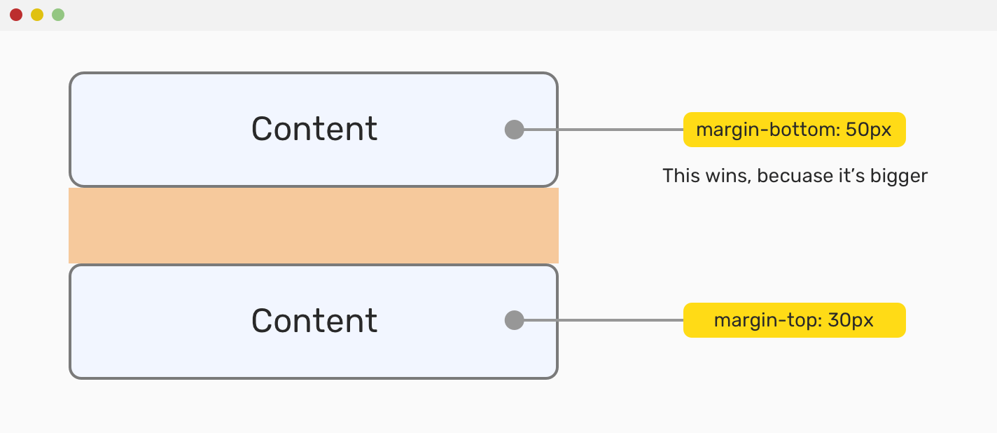
This is pretty much everything you need to know about spacing in CSS, covering grid layout, flexbox, positioning, and lots more.
来源:Ahmad Shadeed
An overview of how to use Chrome DevTools to understand a Web application’s performance bottlenecks.
来源:Sam Saccone
A thought-provoking piece by Ethan that looks at some of the problems inherent in our self-regulated industry, in particular related to performance and accessibility.
来源:Ethan Marcotte
As with the video featured above, here’s a quick look at how to use min, max, and size with the clamp property.
来源:Steve Fenton
来源:Ted Krueger
<progress id="reading-progress" max="100" value="0" ></progress>
来源:Rob OLeary
If for any reason you need to your interface to look like Windows 98 then this library has you sorted. Here’s the associated repo.
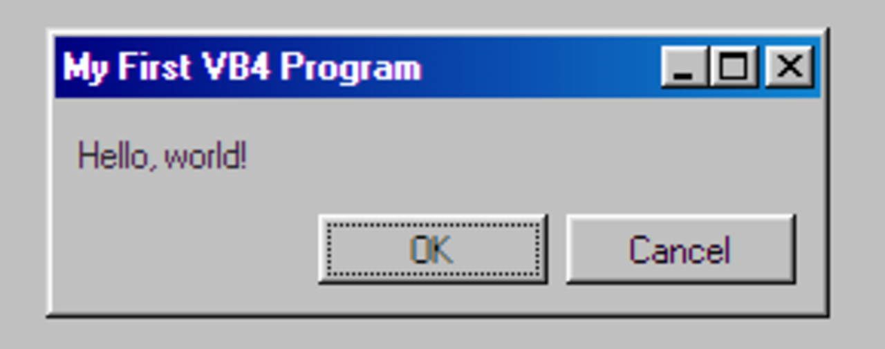
来源:Jordan Scales
We’ve linked to this before, but it’s recently been updated and remains a solid resource.
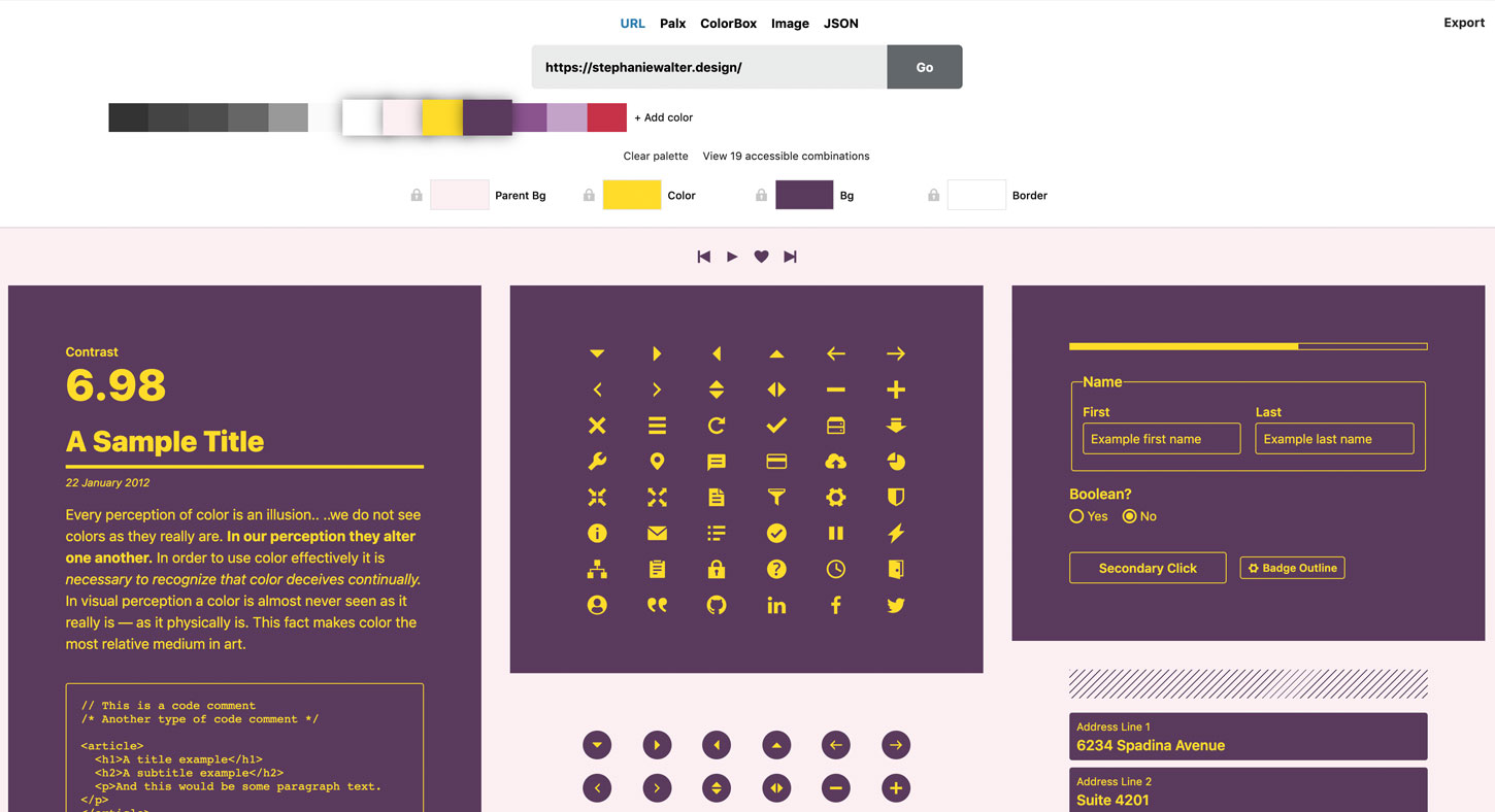
来源:Stéphanie Walter
A handy online tool/wizard for establishing how your (potential) use case will (or won’t!) operate alongside CORS (Cross-Origin Resource Sharing).
来源:HTTP Toolkit
Includes a “lite” (only gray) and “full” version. This is similar to utility class-based frameworks, so the draw here is that you don’t have to write any CSS, just add classes.
来源:Jiten Bansal
A neat little collection of vanilla JavaScript one-liners divided into various categories (arrays, date/time, DOM, etc).
// `arr` is an arrayconst isEmpty = arr => !(Array.isArray(arr) && arr.length > 0 && arr.filter(el => el === undefined).length > 0)
来源:Nguyen Huu Phuoc
Tim Kadlec shares thoughts on the ‘blunt instrument’ of loading stylesheets via preload, and some performance advice around how you go about loading CSS and the DOM order.
Dynamic elements: Nothing new here for frontend experts, but this is a good summary for beginners discussing how elements can be built dynamically outside of the initial markup.
Here’s an in-depth look at a fairly simple feature: the disabled attribute for form elements (and how to handle them).
Kevin Powell shares six simple (beginner) typography tips to achieve a more professional looking site. Skip to around the 3:20 mark to get straight into it.
How to create a fully responsive fluid layout in just 20 lines of CSS (that also includes responsively resizing multi-column elements).
Author Brian Hicks explores reducing asset sizes with subsetting. He uses a headless Chrome instance with Puppeteer to automate font subsetting on his static pages for savings of 87% on the original size.
译者注:如需了解,请查看原文。
译者注:如需了解,请查看原文。
Copyright © 2015-2022 BY-NC-ND 4.0